Greetings!
Below you will find a detailed description of the major settings and features of our responsive themes with illustrations on example of our Business Responsive Theme and examples of setting parameters of administration area of Zen Cart.
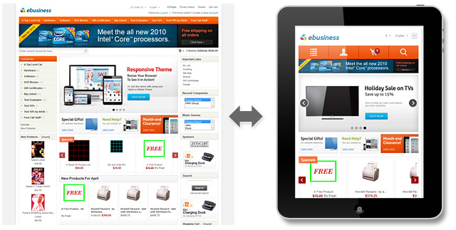
A great responsive template with 5 color variations – Business Responsive Zen Cart Template. The template is fully adapted to major mobile and tablet devices and has a special CSS styles only for this purpose (no separate template files):

Ability to choose different top navigation via “Layout Settings -> Categories-Tabs Menu ON/OFF “ section of Zen Cart admin area:

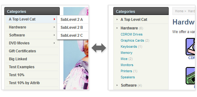
Ability to choose different category sidebox style via “Layout Boxes Controller” section of Zen Cart admin area. Category sidebox with multi-level subcategories dropdowns and sidebox with tree of subcategories:

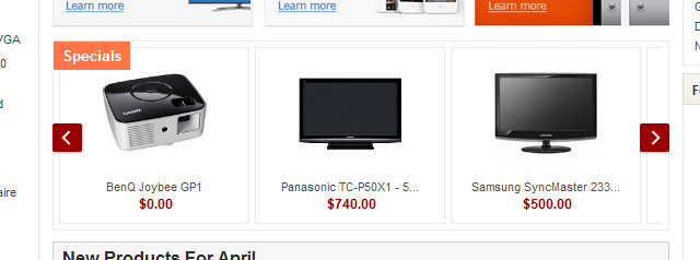
Stylish images conveyor banner with special products that is fully managed through the “Catalog -> Specials” section of the admin area:

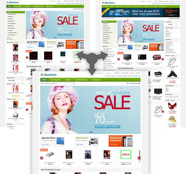
You can set 3-column or 2-column layout via Zen Cart admin area, and even set your home page without columns and all the banners and product listings will fit your new layout size automatically! So, now you do not need to change any CSS files to fit the banners size:

To have the home page without columns you need to place the code you see below to the beginning of your “includes\templates\ACTIVE_TEMPLATE\common\tpl_main_page.php” file:
if ($this_is_home_page) {

$flag_disable_left = true;

$flag_disable_right = true;

}
Zen Cart EZ-Pages are placed to the top and the bottom of the template for both mobile and desktop versions of the responsive template, so you can mange the menus through the admin area.
And much more features on the template detailed page.
These settings can be applied for almost all our responsive Zen Cart Themes.


