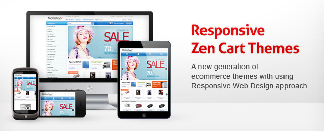
Hello everyone. We are glad to announce the start of updating our Zen Cart templates with responsive design! Nowadays, it is impossible to imagine our live without any mobile or tablet devices. Almost each new client wants a mobile version of their website. The same trend goes for shopping carts. We believe it is essential to have an adaptive design for a variety of devices, such as iPhone, iPad, BlackBerry, netbook, kindle and so on.
The article describes the instructions and features of our responsive Zen Cart templates and some tips of managing the themes elements on the example of our Responsive Zen Cart Theme.
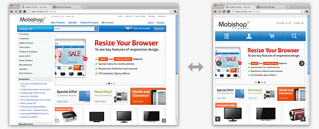
So, the main idea of the responsive web design is about adjustable screen resolutions and automatically resizable images. We have created and used some special CSS style files that are responsible for the template appearance on any device screen resolution. The best way to test the design is to use your mobile or tablet device, but the easiest way is just to resize your browser in order to imitate any screen resolution. The following picture shows this:

Main Features of Responsive Zen Cart Theme
- iOS, Android, BlackBerry, Windows and a range of other devices compatible
- One-click template configuration (allows to get the template settings the same as on our demo site by one click in the admin area)
- Only CSS style files for mobile and tablet appearance
- Color variations
- Responsive slideshow and carousel banners (touch screen adapted)
- Special top navigation for mobile devices
- Dynamic carousel banner (fully managed through the admin area and displays “Special Products” of Zen Cart)
- Fluid/stretchable columnar product listings (via CSS styles!)
- Language/Currency dropdown boxes
- Categories and shoppincg cart dropdown windows
- CSS buttons (Smooth buttons appearance on each device screen, including retina display. )
- The ability to view a desktop version of the template for mobile phones and tablets
- Cross Browser HTML and CSS layouts (Internet Explorer 7+, Firefox 3+, Google Chrome, Opera, Safari browsers compatible)
- Touch screen adapted
- Admin managed home page banners
- Flexibility
- No back link required
- No affection to core functionality
- No affection and changes of default database scheme
- Easy to change the design and layout
- Easy to install
The template does not require a separate installation of Zen Cart or any mobile theme to look adapted for tablets and mobile devices, only CSS style files are used for this purpose.
You can easily set 3 or 2 column layout via Zen Cart admin area. All Zen Cart admin features are stayed untouched, so you can change all the elements after the template installation by the same way as you can do it via default Zen Cart admin area. Only one setting parameter is disabled for the theme in the admin area (column width) due to the fact the responsive feature requires a special layout, so we created a new layout that is based on “div” HTML tag, not table. Columns width is defined automatically when you change 3 or 2 column layout.
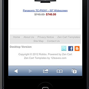
 For those who want to view a full version of site we provided a “Desktop Version” link at the bottom. So that the user can switch the mobile and full version of the site easily. Surely, the link appears on small screen resolutions only.
Fluid columnar product listings automatically set a numbers of the columns via CSS styles, so that it gives the template a professional look on any mobile and tablet devices.
Working with Zen Cart Add-ons
Zen Cart add-ons that contain the same files as our template package may affect the template functionality due to the fact that the responsive feature requires a special layout to function properly. So, if the add-on you have now use the same template files as our template package, you need to merge that files manually and the theme and your add-ons will work absolutely correctly. All the add-ons that are related to Google, payment methods, checkout (and so on) will work correctly with all our themes right after the installation. You can test any add-on on our free themes before purchasing premium one.
See all features and settings of almost all our responsive themes on the example of our Business Responsive Zen Cart template.
Give your shopping cart a new professional look with our Responsive Zen Cart Template!


