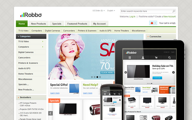
Greetings! We are glad to announce our another Robbo Responsive Zen Cart Theme with four color variations (black, green, red and pink) included. The template allows you to get a well-adaptive template appearance for any devices, including a wide range of tablets and mobile phones. More information regarding the theme you can find on the template detailed page. Some useful information regarding our all responsive themes please view there.
See all features and settings of the theme on the example of our another Zen Cart template.
You can easily set 3 or 2 column layout via Zen Cart admin area. All Zen Cart admin features are stayed untouched, so you can change all the elements after the template installation by the same way as you can do it via default Zen Cart admin area. Only one setting parameter is disabled for the theme in the admin area (column width) due to the fact the responsive feature requires a special layout, so we created a new layout that is based on “div” HTML tag, not table. Columns width is defined automatically when you change 3 or 2 column layout.


